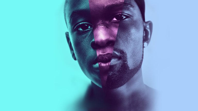
Moonlight, Barry Jenkins’ 2016 Best Picture winner, wasn’t shot on film at all. It was shot digitally, on a single Arri Alexa XT, in ProRes rather than raw. And yet its three chapters, “Little,” “Chiron,” and “Black,” each read as if they were captured on a different film stock entirely, because they were, just not in the camera. Colorist Alex Bickel built the difference in the grade, and how he did it is a better lesson in what “film look” actually means than most of the gear debates that claim the term.
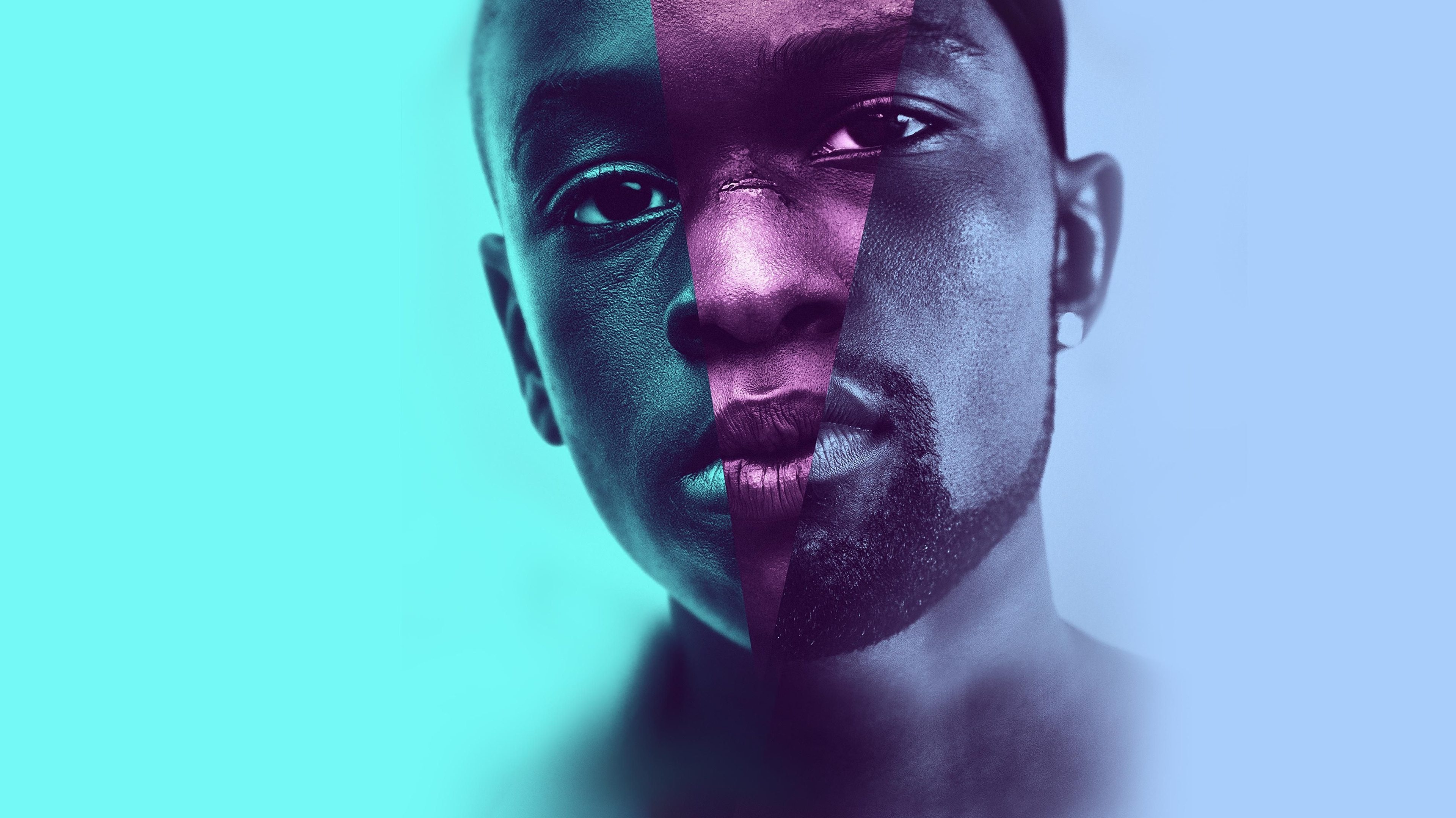
Image: Moonlight (2016), © A24 / Plan B Entertainment / Pastel Productions. Used for the purposes of criticism, review, and commentary under the fair dealing provisions of Section 29.1 of the Canadian Copyright Act (R.S.C., 1985, c. C-42). The image illustrates the editorial analysis above and is not used as a substitute for the original work or for independent commercial exploitation. All copyright in the image and the underlying film remains with its respective rights holders.
One Camera, Three Different Film Looks
Working with colorist Alex Bickel and color scientist Bill Feightner, cinematographer James Laxton and Jenkins settled on a chapter-by-chapter emulation strategy rather than one consistent digital grade for the whole film. The childhood chapter, “Little,” was pushed to read like Fuji stock, which Bickel has described as carrying “kind of this in-between warmth” that brings out texture in the skin. The teenage chapter, “Chiron,” shifts toward an old, long-discontinued German stock known for adding cyan into the highlights, giving the film’s middle section its distinctive greenish-blue cast. By the adult chapter, “Black,” the grade moves to a modified Kodak emulation Bickel has called less “restrained,” with more pop and shine in the image. Three separate identities, one uninterrupted digital negative underneath all of them.
That distinction only works because the skin itself was treated as the priority, not the backdrop. Laxton was explicit about it on set: “The way in which the performers’ skin looked on camera was critical to us… we made strides to make sure that was there even when it may not actually have been.” Bickel’s own grading philosophy, which he’s applied across other work including Everything Everywhere All at Once and Lady Bird, follows the same logic: “I actually expose for skin tone first, rather than start with the environment. I build grades from faces out, for everyone, for every face of every colour.”
Shot Lean So the DI Could Do the Real Work
None of this was a last-minute rescue job. Laxton built his on-set workflow specifically to leave room for it, monitoring in plain Rec709 rather than a custom LUT: “There can be a great advantage sometimes to having a DIT provide LUTs and start that base coloring process, but for this project and the pace we needed to work at, just monitoring Rec709 seemed like a simple and fast workflow.” His job on set, as he put it, was to “provide a dense negative knowing later in the DI we’ll refine the images” — shoot for maximum information, and let the real look-building happen in the grade, where three distinct stock emulations could actually be built and compared side by side. It’s also worth noting how unadorned the rest of the shoot was: “It was entirely a one-camera show. There was never a B-camera on the job,” shot through Hawk V-Lite anamorphic lenses Laxton chose for being “very sharp lenses and also very contrasty lenses.”
The Look Was Always a Grading Decision
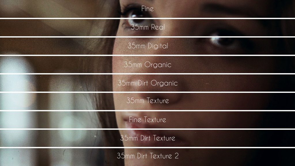
Nine years on, Moonlight is still routinely cited as one of the great “film” looks of its decade, and it never touched film stock once. The three-stock structure worked because it was a story decision first: three chapters of one man’s life needed to feel like three different eras of memory, and color was doing that job as much as the screenplay was. That’s the actual takeaway for anyone grading footage today, digital or otherwise. Getting a specific film stock’s character onto a shot doesn’t require owning that stock anymore, or even a colorist as good as Alex Bickel, just a grade genuinely built around it. Grainzilla’s own 4K Organic Grain and 4K 35mm Real Film Grain packs exist for exactly that instinct — matching a texture to a chapter, a mood, or a memory, the same way Bickel matched three stocks to three ages of the same character.
The lesson Moonlight actually teaches isn’t about Fuji versus Kodak versus a dead German stock. It’s that the “look” of a film was never really about what was loaded in the camera. It’s about what happens to the image after, and whether anyone building that grade is paying attention to the faces telling the story.
Sources:
- IndieWire — “Moonlight Cinematography: Bold Color, Rich Skin Tone, High Contrast”
- Filmmaker Magazine — Matt Mulcahey, “A One-Camera Show: DP James Laxton on Moonlight”
- The Moveable Fest — Stephen Saito, “James Laxton on ‘Moonlight'”
- Three Magazine — Jalani Morgan, “For ‘Moonlight’ Colourist Alex Bickel, People Come First”