Darius Khondji does not aim for perfection. He has said so directly. On Marty Supreme — Josh Safdie’s 35mm period film about obsessive New York table tennis player Marty Mauser, with Timothée Chalamet in the lead — Khondji shot on Kodak Vision3 500T 5219 and pushed the negative in processing to amplify the grain. The American Society of Cinematographers described his goal: “a new, fast stock with an interesting grain structure that we could play with in the processing.” The result is what the Filmmakers Academy called a “painterly look” with a physical crust or skin to the image, like the surface of a canvas. It’s not an effect applied in the DI. It’s cooked into the emulsion.
Four-Perf 35mm on Arricam — Not Handheld Digital
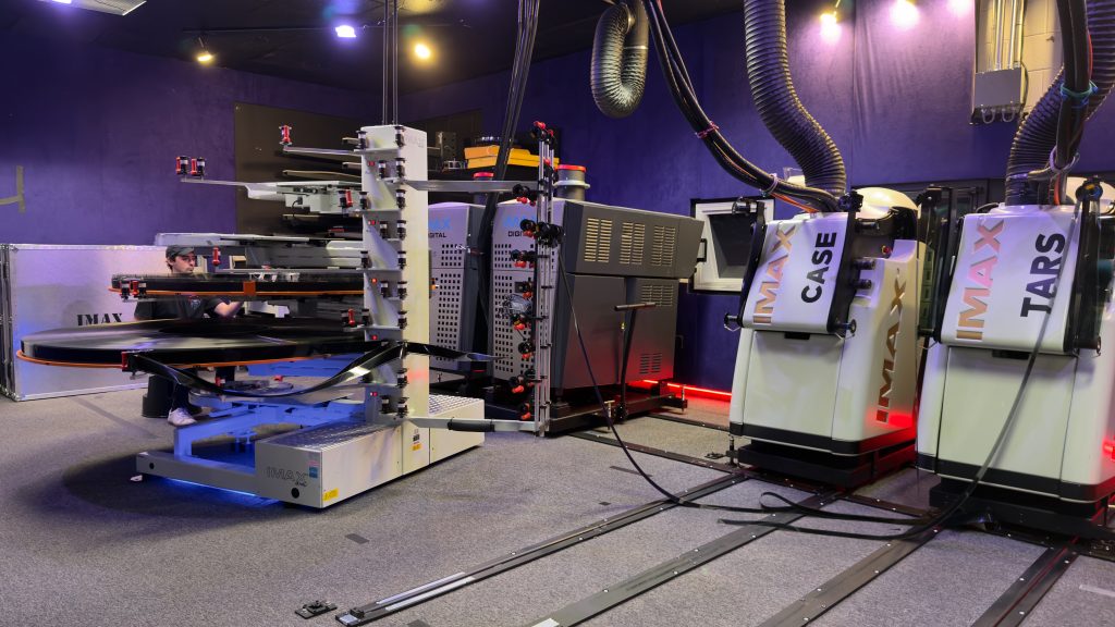
Uncut Gems, Khondji’s previous collaboration with Safdie, was shot handheld on digital — that film’s nervous, close-quarters energy came from its format as much as its editing. Marty Supreme is the opposite choice. Four-perf 35mm anamorphic at 2.39:1 on Arricam LT, ST, SR, and Bolex cameras. The glass was Panavision C Series and B Series anamorphics — what Khondji calls his “jewels.” Khondji described the switch back to film as “an incredible pleasure” and said it had made him want to shoot on film more than ever, calling the format a way of getting “closer to reality, closer to love, and closer to the way life is experienced.” The film received both 35mm and 70mm theatrical prints, processed at FotoKem, alongside a 4K DCP. Colorist Yvan Lucas at Company 3 completed the grade.
The 70mm blowup isn’t common practice for a period piece like this, but it makes sense given the visual philosophy Khondji and Safdie were working from. Long lenses, pushed grain, 1950s New York light pools — those textures get bigger and more present at larger formats. The projection is part of the argument.
Long Glass and the Close Face
Khondji’s guiding principle on the film was simple: “The story is told by faces.” Everything else was built around that. The lens choices follow directly. He used 65mm, 75mm, and 100mm anamorphics for what most DPs would treat as wide or establishing shots. A 360mm appeared frequently. One shot — Gwyneth Paltrow in close-up across the full length of a sports arena — was captured with a 3200mm lens, a piece of glass Safdie spotted. The widest lens Khondji deployed on the whole production was approximately 40mm.
That counterintuitive use of long glass on faces makes close-ups feel monumental without distorting the subject. Khondji described it as using the lens “almost like having binoculars or a magnifier” — searching the actors’ eyes for what’s underneath. The anamorphic format at those focal lengths compresses depth of field sharply, throwing everything behind the subject into painterly blur, while the faces themselves carry the pushed grain and the “dirtied-up” palette production designer Jack Fisk built into every surface. Fisk avoided white entirely — it “burns a hole” in celluloid — keeping the period palette in rich, darkened tones that Khondji said complemented the film stock’s texture on skin.
The Poor Light of 1952
Khondji’s lighting concept for the film was what he called “poor light” — the specific way that 1952 New York used illumination in isolated pools rather than as an ambient constant. He turned lights off deliberately. For the ping-pong sequences, vintage “mushroom lights” provided top-down illumination that Khondji described as having nothing more beautiful coming down on faces. For street sequences, a camera car with a small hand-operated crane let the crew thread through tight Lower East Side angles while maintaining what the Filmmakers Academy described as “kinetic grace.” Tournament venues got single-direction sources that Khondji described as murky and dirty — a word he uses as a compliment.
The film’s final hospital scene was shot documentary-style from a distance, crew intentionally hidden and silent. That’s not a technique imposed on the material — it’s the natural endpoint of a production that treated the camera as something that should earn its position in the frame rather than announce itself.
Se7en’s Darkness, Thirty Years Later
Khondji’s signature approach to light and grain has its most famous reference point in David Fincher’s Se7en (1995), where he underexposed many interiors by two stops on an already contrasty negative. His explanation has been quoted so often it’s become part of how cinematography students understand the relationship between underexposure and contrast: “underexposing by two stops really made the exteriors come alive, whether in the desert or the city, so that the brightness is always coming from the outside.” Fincher actively encouraged the approach, and the resulting darkness — practical sources only, almost no conventional film lighting — redefined what a crime film could look like in the mid-nineties.
Marty Supreme is warmer and more period-specific than Se7en‘s cold industrial world, but the underlying philosophy is continuous: resist the even ambient exposure, build a world from specific, deliberate sources of light rather than from fill. The “poor light” of 1952 New York is Khondji’s way of doing the same thing Fincher asked of him in 1994, updated for a different palette and a different city. “I love dirtiness and I love layers,” Khondji has said — and Marty Supreme, with its pushed 500T emulsion and its long anamorphic glass and its tables and faces lit from mushroom fixtures above, is the most fully realized version of that aesthetic he has put on screen in decades.
Three Films in One Year, One Oscar Nomination
Khondji shot three major films that released in 2025 and 2026: Mickey 17 for Bong Joon Ho, Eddington for Ari Aster, and Marty Supreme for Safdie. Talkhouse called it a year that would earn him a cinematographer-of-the-year designation if such an award existed — “proving he is one of the greatest artists working in the medium today.” He received an Academy Award nomination for Best Cinematography for Marty Supreme, losing to Autumn Durald Arkapaw’s work on Safdie’s earlier collaborator Ryan Coogler’s Sinners. The loss is not the point. Three films in 14 months at that level of craft, each with a distinct visual grammar, is the point.
For editors and colorists working on projects where the look matters — where the goal is a specific texture and a specific relationship between shadow and grain — the technical choices Khondji made on Marty Supreme are worth studying closely. The pushed Kodak 500T grain structure, the “poor light” contrast between isolated sources and deep shadow, the specific quality of warmth in long-lens anamorphic: these are achievable in post, with the right grain overlays and the right grading approach. The organic version is thirty cans of 35mm film through an Arricam. The post version is knowing exactly what you’re trying to match and being specific about it. Grainzilla’s 35mm Film Grain Pack and the 1080p Film Grain Pack 2.0 both give a direct entry point into that texture without the FotoKem bill.
Sources:
The Look of Marty Supreme — Filmmakers Academy
“The Story is Told by Faces”: Darius Khondji on the Cinematography of Marty Supreme and His Prolific Year — The Film Stage
Darius Khondji Explains Why Marty Supreme Was Shot on Film — Discussing Film
The Cinematography of Marty Supreme, with Darius Khondji, ASC, AFC — Newsshooter
Marty Supreme: Cinematography by Darius Khondji — American Society of Cinematographers
Best of 2025: Cinematographer Darius Khondji Is Always Absorbing Images — Talkhouse
Darius Khondji Cinematography Style Explained (Se7en, Uncut Gems, Okja) — StudioBinder
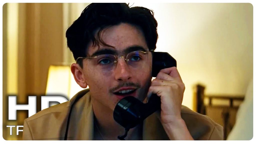
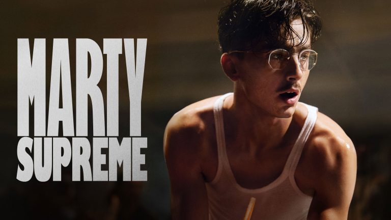
Image: Marty Supreme (2025), © A24. Used for the purposes of criticism, review, and commentary under the fair dealing provisions of Section 29.1 of the Canadian Copyright Act (R.S.C., 1985, c. C-42). The image illustrates the editorial analysis above and is not used as a substitute for the original work or for independent commercial exploitation. All copyright in the image and the underlying film remains with its respective rights holders.